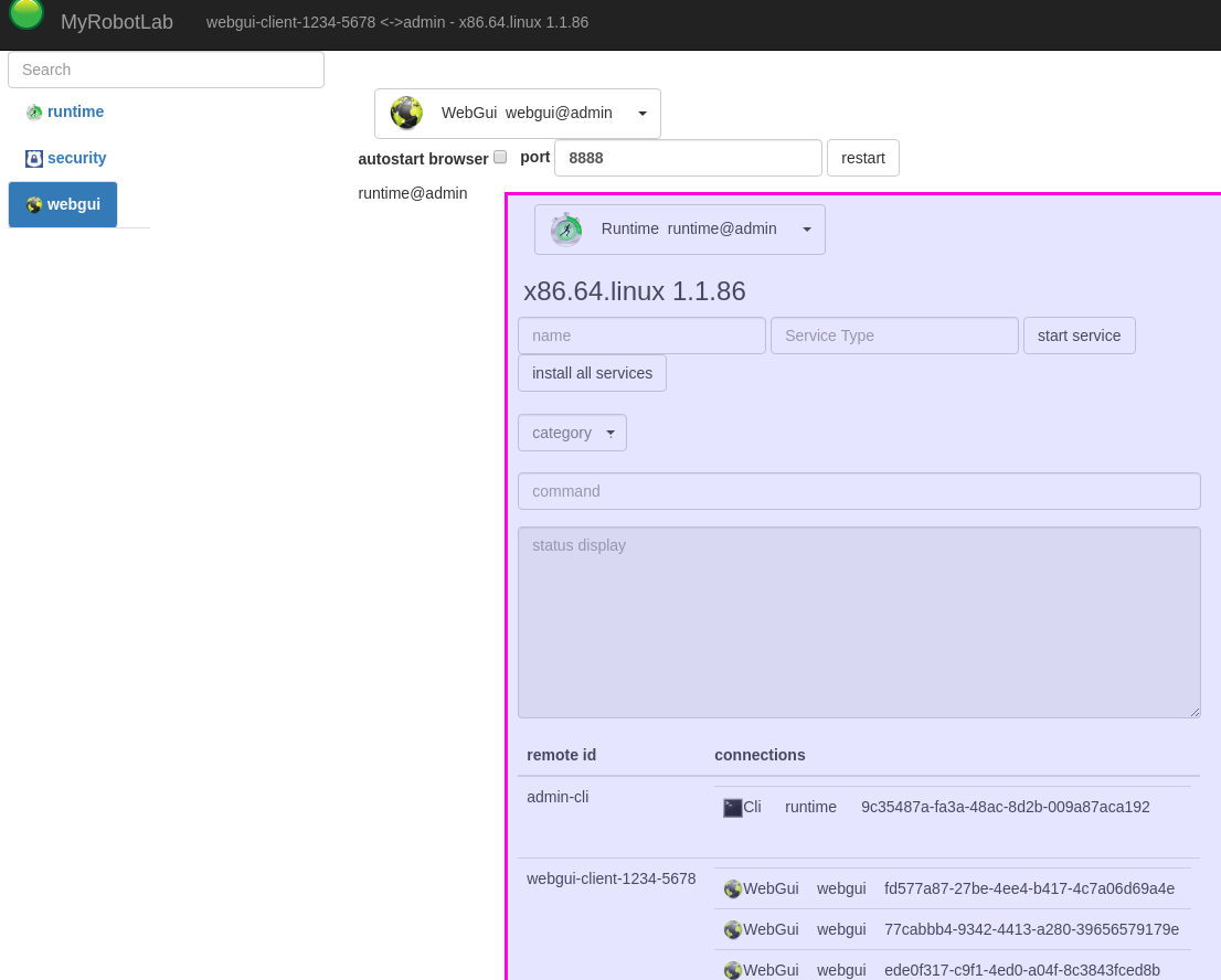
This is a "hacked-up" WebGui service ui with an embedded Runtime ui. It worky !
MaVo did most of the framework for putting together the current AngularJS. I just suggested some designs, and he coded it up. Only now am I starting to understand how it all works (or at least beginning to understand).
It's taken a while to figure out how to do this, but it should be helpful whenever we want to show "parts" or pieces, or full UIs from one service inside another. Composite services like InMoov2 should benefit.
I still have work to do to figure out the best way to hide or show parts and pieces of the embedded UIs, but this is progress !
Here is an example. The WebKitSpeechRecognition has a lot of logic on wether its mute or not, I would had to see the code replicated again to show this button ... that would be a mess, and very difficult to maintain.
Instead it "will be" the WebKitSpeechRecognition actual button showing the "actual" state of being stopped or recording. Additionally, any improvement or fix to WebKitSpeechRecognition automagically fixes this button, because they are the same, same goes for the dropdown.
Wow that sounds like
Wow that sounds like magic!
The fact that we can use just a piece of the original UI and it still communicates wth the original UI.
Also it sounds good that fixing the original, fixes the piece used somewhere else.
Hello Grog, Is this already
Hello Grog,
Is this already implemented somewhere in the .js ?
Can I already start working with it?
I noticed that now when I start a InMoov service, the main UI disappears to give a blank page, I am guessing it's related to this update and if possible I would like to make the links between InMoov UI's.
Hi Gael, It's not optimal,
Hi Gael,
It's not optimal, there are some problems with it, but I can show you how to get a UI in UI with the understanding that it will probably need to be refactored.
in the js file these 2 lines need to be added near the top :
I'll be looking into how to solve this issue.
Thanks a lot, I will test it
Thanks a lot, I will test it now.
Can you call another service like this:
<div class="tab-content" service-body panel="mrl.getPanel('i01.rightHand.wrist')"></div>
Edit update: ok I just tested and it works great!
I have a question is it possible to use this also to travel from main UI to a sub-UI ?
Can you call another service
Can you call another service like this:
<div class="tab-content" service-body panel="mrl.getPanel('i01.rightHand.wrist')"></div>
yes you need to change the js part that does this $scope.panel = mrl.getPanel('i01.rightHand.wrist')
I have a question is it possible to use this also to travel from main UI to a sub-UI ?
there was .. but it never worked well .. I can see that this is very important .. .I'll look into it
hello Grog, You wrote in the
hello Grog,
You wrote in the shoutbox that you implemented UI to UI using:
Initially the method was only
Initially the method was only available in nav.html ... but now its available anywhere
The syntax is :
where ng-click can be put into almost any element (link, button, div, etc...)
Yes, any name can be put into the function, however, hardcoded text is not preferred. 'runtime' and 'security' are the only two services that are guarenteed to have those names.
Preferred to peers would be <a ng-click="changeTab(service.name + '.leftHand')">Left Hand</a>
This means InMoov2 could be "bob" and the link would still work ;)
I understand this doesn't work for
<a ng-click="mrl.changeTab('i01')">Back</a>
because peers don't have references to their parents. (Hmm, that would be useful)
Go ahead and do it, I'll fix it later.
mrl.changeTab is in pr
https://github.com/MyRobotLab/myrobotlab/pull/661
Without arefresh of the
Without arefresh of the browser or manually resizing the browser page the sliders are going outside the UI.
And slider buttons are all stucked/collapsed on the left side. We also have an issue because the buttons are for the input mappings which is not what we want for configuration. Inmput mappings are default (although we should have an advanced access to change them if necessary.
We want the output mappings for user to configure their robots servos.
Hi Gael, I think I already
Hi Gael,
I think I already solved the problem of slider.
Yes, if the screen width is less than 1920 it's a problem with the fields and buttons in a single line.
What do you think if we order the buttons below?
It's hard for me to identify the fields and the related button.
That way you can reduce the width of the servo slider, it does not make much sense that the mosue has to travel so far to set the values. And maybe the slider controls could be a little bigger for easy use on a touch screen.
1-If it could be simplified as much as possible, we could shorten that and gain space. Maybe remove the servo icon too. Could be leftHand.majeure o just majeure? We already know that we are on the left hand. The drop down Internally it would have all that, but it is not necessary to show it. As a user I don't think it's helpful to have all that information as a label. Is it possible to show only the last part of the service?
2-It seems to me that the logical order for a beginner looking to configure a servo should be the controller with the PIN first, then the limits, and then the position.
3-I don't know what parameters the sensors contain.
In this way it could better accommodate narrow screens and widen on large screens.
What do you think?
Hi Astro. Your work looks
Hi Astro.
Your work looks great.
1. yes it can be removed - for the inner workings its very important, but not for display. The icon could be removed too, but I think this adds a little value in that it's identifying the Service Type.
The full name (without @id) and the type .. should be minimal. e.g.
i01.leftHand.majeure Servo
Hello Astro, It all sounds
Hello Astro,
It all sounds pretty good to me!
I am only wondering about consistency between the other panels if you remove the icon.
I really would keep leftHand.Majeure.
How do you plan to change the servo configuration for InMoov UI ?
What we currently do is integrate a service panel into InMoov UI, so unless you remodel the service itself I don't see how you want to do that. Check the panel brain/ON/settings, you will see that it's a big service that keeps extending more you chat with the robot. Also the service ear/ON/settings
Regarding the sensor, I still don't know how I am going to do it, And I think I will need a bit of space...
I have been swapping and remodeling buttons to finally find a good way to have constency for almost all the services. I have been working on that for a whole damn week...
The way it works is when you click OFF/ON it opens up a SETTING button which opens a new panel for to work the settings. This allows me to have the same configuration for the hands but also for to configure the controllers or the PIR or any of the integrated services in InMoov UI.
I had to find a way to wait for the service to be loaded before it could open the panel, otherwise most of the time the panel would be blank. And it still stays blank unless we execute a F5. not really nice... I hope Grog finds a way to refresh quietly. For exemple, if the OFF/ON button was the one to open the panel, it was going always to a blank page.
Note that I am trying to get the whole InMoov UI finished as soon as possible. because I already know that when the confinement is finished, I will have no more time to continue on this.
The sooner all of the UI works, the better. Even if it doesn't look perfect, we can always clean up stuff after that. So I am running against the clock.
:)
I get it. What happens is
I get it.
What happens is that my brain works in "old school web designer" mode.
So I think of a dropdown like something:
Majeure
<select id="Function">
<option>Function</option>
<option value="Servo iO1.leftHand.majeure@curly-logan-helpCommand">Help<option>
<option value="Servo iO1.leftHand.majeure@curly-logan-releaseCommand">Release<option>
</select>
Majeure
Where the code is not forced into what is seen. So what you see is more friendly and not what is under the hood.
But I understand this is not the case, it was just a suggestion to simplify and save space, because the window expands a lot. And it seems that we have no control over the space of that label could take.
Check the panel brain/ON/settings, you will see that it's a big service that keeps extending more you chat with the robot. Also the service ear/ON/settings
I don't know how to get there. Using dev, I only see this and if I add the inMoov or InMoov2 service and an arm for example, I can't get to see the Inmoov interface with the circular buttons.
What I did was test the exe file that you offered Guillermo InMoov2_MyRobotLab.EXE
and there I began to distribute the buttons of the servo interface.
I don't know how to get there in dev where we work in webgui_work
Apparently we have to change the size of the notification window. Wider so that it does not overflow and limit the height in half, I think.
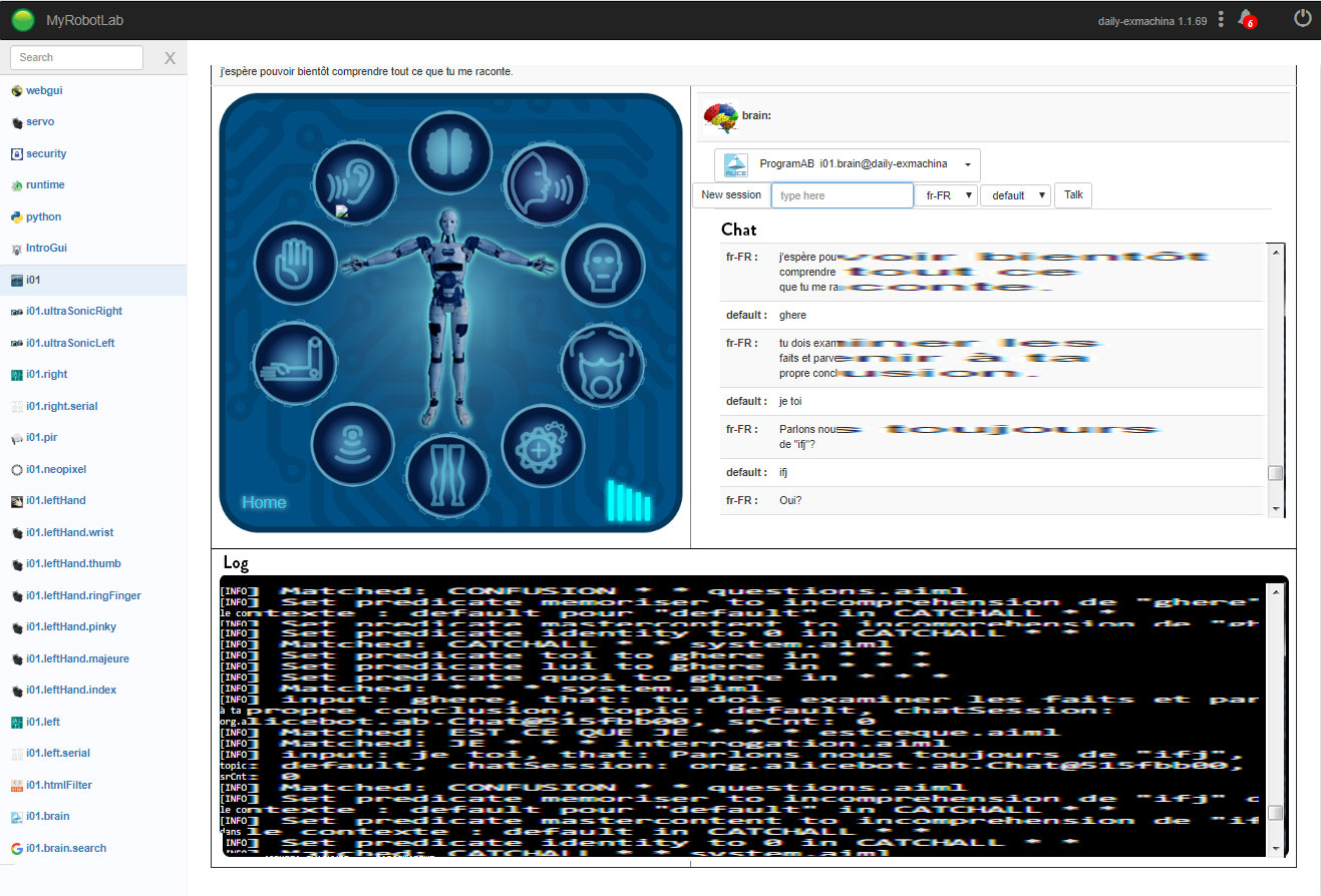
That "Log" window in Brain: Do you need to see all the time?
Or could it be seen with a button in a floating window like notifications?
I already know that when the confinement is finished, I will have no more time to continue on this.
The same here, apparently on Monday the 13th.
The sooner all of the UI works, the better. Even if it doesn't look perfect, we can always clean up stuff after that. So I am running against the clock.
Yes, don't worry if something does not look pretty, there will always be time for improvements, the important thing is the functionality.
May the force be with us always!
I will continue to see what else I can do while I can.
Hello Astro,The dev doesn't
Hello Astro,
The dev doesn't take the latest of InMoov2, this is the reason in my .EXE I have added the INSTALL_INMOOV2.bat, which will install the latest zip directly from the github repo. (make sure to make a fresh install because it will not write over previous install)
Once installed, you can click on START_Temporary.bat, this will use the InMoov2Temporary .py
This allows GUILLERMO to start the services that currently are still disfunctionnal in InMoov2.java and which cannot yet be started via the UI. That is the reason it's called temporary. (IntroGui, InMoov2Gui, PIR, UltrasonicRight/left, arduino right and left, neopixel)
You will then be able to select IntroGui or InMoov2Gui.
With the round buttons you can select Brain/ON/OFF/settings-->get the panel.
We want to keep the log for brain because it is a main work instrument when creating AIML. Ideally the log and the chat robot/human should be in a container that has a scroll bar to avoid expanding the UI.
But those modifications should be done directly in the HTML of the service.(programAB.html)
I think we need to model those HTML services to have a consistency to fit within graphical UI environment.
It can be for InMoov2 UI or Intro UI or what ever UI somebody wants to create.
If you open the neopixelGui, you will see that it is better constructed with dropdown menus caret and colored buttons. we should have this kind of aspect for all the HTML services.
If we can achieve this for now it will be huge.
Update on my thinking:
I believe the InMoov UI should be thought as a transition plateform between code and complete graphical. It is meant to get users to go look under the hood. This is the reason we shouldn't remove things like i01.leftHand.Majeure or isRightHandActivated
@Grog, this is also the reason "eye" instead of "OpenCV" is not a good thing.
The message logs should be under the UI and not hiden, we need to read the errors or warnings when they appear.
Hello Gael! I get it! I
Hello Gael!
I get it!
I was trying to simplify things too much. Now I understand better the objective.
A more technical interface can help make it less confusing when the user needs to get into the code.
Thanks for all the patience.
I started over by creating a mrlx folder and running the exe and this is what appears to me.
There is no INSTALL_INMOOV2.bat, so I run INSTALL_INMOOV.bat and continue with the steps.
Upload MrlComm from resource into Arduino. OK.
I get to this screen.
Active ear, brain, mouth, lefHand.
I can't see that Chat and Log screen.
1) I don't know if this should be green, I can't find a way to activate it.
Just now that I'm taking the screenshots, I realize that I haven't connected the Arduino at any time. An important step for the beginner who does not know where to start.
2) Beginner mistake. When I see that "attach" is empty, I thought I had to put where the Arduino was, so I put COM3, and nothing happened. At some point of coming and going, I deleted, changed the size of the screen and just pressed the backspace and only then did the options i01.left and i01.right appear.
If it is possible, this should be changed to a dropdown. A text field gives place to put anything.
It can be frustrating not knowing what is going on. It took me a while to figure it out.
I was finally able to move a finger :)
Those osteoarthritic fingers from more than a year ago that did not move haha.
What do you think if we make the chat area and the log area wider, so that the lines of text are less broken and the reading is easier?
But I see that depending on the aspect ratio of the screen, the log part would be short with few lines.
In my case I would be seeing something like this and the short log may be uncomfortable.
Perhaps for this screen you could take out the interface of the InMoov and have vertical panels for Chat and Log, side by side.
I am fighting with bootstrap in ServoGui.html, I need to keep learning how boostrap works with columns but I am getting something.
Okay. I was able to open the
Okay. I was able to open the log. What do you think of this?
I just tried to hide the UI. If we put Chat in a DIV and in another DIV the Log, we can add the scrolls.
Hello Astro, Note that the
Hello Astro,
Note that the EXE you got is a temporary package.
Many things don't work yet. The problems to be solved are either in Java or in the HTML,JS, CSS.
You should re-install again, because I see you have yesterday's version. I have modified it since then.
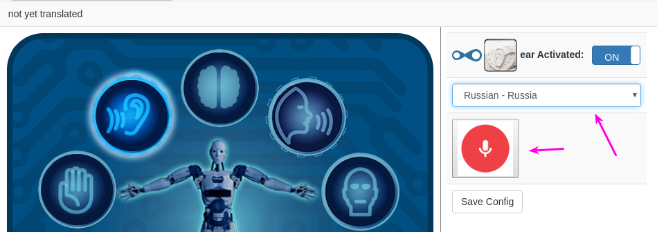
1- The red dot for example is a ng-show="isLeftArmActivated" that I want to set but I can't figure how to make two HTML communicate accross each other via JS. It should automatically be green when you turn ON a leftHand.
The InMoov2Gui.html start the state ng-model="service.isLeftArmActivated" and InMoov2ArmGui should receive the state. Help is welcome on this...
2-You are completely right, this should be a drop down menu (it was before, but somehow got changed).
I tried to fix that last week but without succes. Note that Grog modified it for the JME attachment (virtual)
Also it would make more sense if the "detach" button replaces the "attach". To temporarly remedy to this I added a tittle="Type or select a controller"
3-I think the way Grog has set the log next to the chat is pretty good, and for to work it makes it easy to spot which AIML is responsible for such and such answer.
I think having a scroll bar would be the best approach I think. Otherwise, I would go for the option to have it under like this, but again I really think the notifications should be there also.
Hello Gael I downloaded
Hello Gael
I downloaded InMoov2_MyRobotLab.EXE again, but the files appear like this.
So I changed the name to myrobotlab.jar and InMoov2Temporary.py and it worked.
"I can't figure how to make two HTML communicate accross each other via JS... Help is welcome on this..."
We need Grog's help here with the websockets i think, I haven't had time to start learning Angular yet.
I can add scrolls to Chat and Log, but that is not in webgui_work branch.
1) We can add an "Expand" button that changes the id style "container-cell" to display: none; That would expand the Chat and the Log, and then change the button to "Normal view" or something similar to change the id "container-cell" to display: table-cell, and InMoov reappears.
This is thinking about usability, if you see it on a device that is not very wide, the Log could be cut.
2) I have also seen that if you say "play video" or something that appears as a link, makes the entire chat table expand, something to keep in mind, that can be easily solved as well.
3) Notifications could be replicated so that they appear below with scroll and have them always in view on this screen.
Hello Astro, I have modified
Hello Astro,
I have modified the executer which should now install the correct named files.
1- sounds very good
2- "play video" is expanding the cat session, I think this not good, it should be constant size using class="col-md-6" or something of your choice. If we can fix that it would be great. By the way, you could also tell him to play music, but now the AIML is searching for the config file which doesn't exist, with path to directory )
3- totally great to me!
It's a bit a nightmare for me. The transition from Manticore to Nixie makes a lot of things not worky and I don't know how to fix them. In another hand, I am really glad the webgui is getting graphicaly to a point of satisfaction. With graphical buttons, beginer users will be able to achieve a lot in no time. In fact they certainly will want more very soon.
Like a graphic controller dashboard for exemple "forward" "backword" "turn left" "turn right" . Very cool to have that in MRL.