Update:
Now with the side panel and MyRobotLab logo.
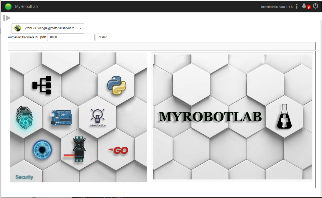
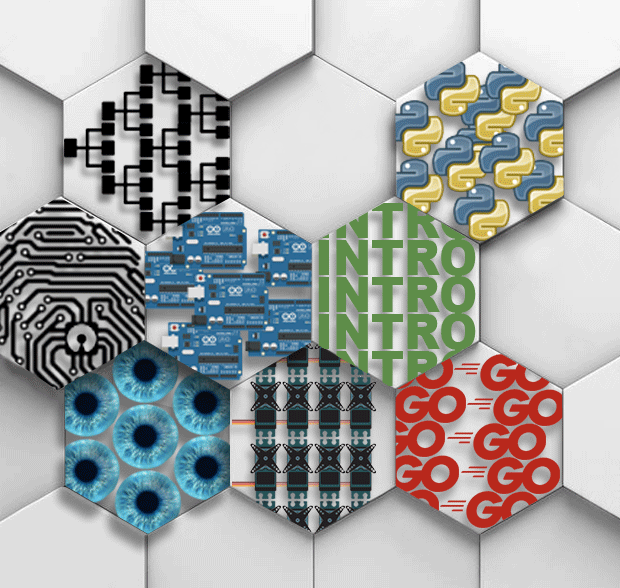
I have made a set up in webgui_work so you can test the homepage into mrl. As you said I made it sleek and modern, in the end I preferred making some sort of icons instead real graphical drawings like the 3D.js page.
This is because if in the future, you want to add another button, you can create it yourself without to have a designer to draw it for you.
Each button has a title included in the HTML file to give a hint about it's usage.
Currently I didn't make css functions to change the aspect of the buttons when mouse is hovering or when we click on it, but some of the buttons open up the side panel or links.
Buttons are:
- serial
- python
- inmoov
- arduino
- vision
- servo
- introduction
- and fast go
- security ( but it's coded in the html, it doesn't show here)
But overall, it looks like this:
Looks Great Gael !
Looks Great Gael !
(No subject)
(No subject)
That's where i go to do my
That's where i go to do my changes on github:
Was the big table border
Was the big table border desired ?
hmmm should panels appear to the right when tiles are pressed
Great... So the 2nd panel is
Great...
You posted your changes directly to webgui_work ... you are now a git guru ! :)
I pulled them in..
So the 2nd panel is for tutos ? After clicking on a tile ?
Mine looks like this, but I'm starting perhaps to see what you mean
I'm going to create and move all this Intro stuff to an Intro service.
It will allow us to start making very easy buttons of functionality, while keeping the webgui functionality very clean.
Hello Grog,I think you
Hello Grog,
I think you installed while I wasn't finished pushing my modifications.
That is why the Myrobotlab logo is small and on the right side.
Also all buttons are directing to something now. This is just for demo buttons, we need to improve the tutorials a what will be the links.
Yes the right panel disapears to give place for some tutorial information if necessary.
It was not easy to adjust the size of the image on the right panel to still match the left one.
I have added a non cropped image in the resource/WebGui/app/img/WebGui for the right panel just in case for the future.
Update: with a tutorial on the side panel:
Thoughts?
An idea for the start page, following Gael's idea for the two white panels serving as a doorway or gateway so to speak to the rest of the areas. I have a kind of holodeck idea i'm working on for the screen for controlling the Virtual InMoov. Should help to simplify a few things, as well as make it a bit more interesting to play with.
Also have a design laid out for the python tutorial/video/ide section.
Will work on finishing that one when i wake up in a few hours.
Let me know what you think on this.... still some tweaking i need to do to it as far as some lighting and giving Gael's icons a 3d appearance.
Hi Shaun, Looks
Hi Shaun,
Looks interesting.
For Nixie I am trying to go very minimal ... "Less is the new More"
Even now I think its maybe too much, and it should be further reduced and not have 2 panels... just haven't worked on reducing it yet.
The original idea was to model something similar to https://d3js.org/ window, where every tile is a working example..
That is an interesting idea
That is an interesting idea on d3js.
Hello, Looking at Shaun's
Hello,
Looking at Shaun's proposition, it appears to me that maybe we should think of a theme template system available in CSS.
This way the user could select a default template or select a define template or even access to the theme CSS file to create his own theme.
Basically, very few elements would be movable but the background, typo, contours, colors could be changed.
This would certainly give users the option to make propositions of fancy themes for the next release and Grog would choose the theme to be by default.
Could that be something possible for after Nixie?
Yes I agree .. theme'ing !
Yes I agree .. theme'ing ! :D
But for Nixie its just getting webgui worky enough to be useful to noobies.
Worky First - Theme After